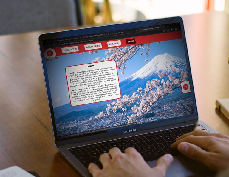
GARAMOND PRO RESEARCH POSTER

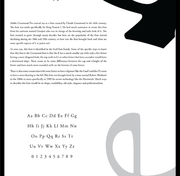
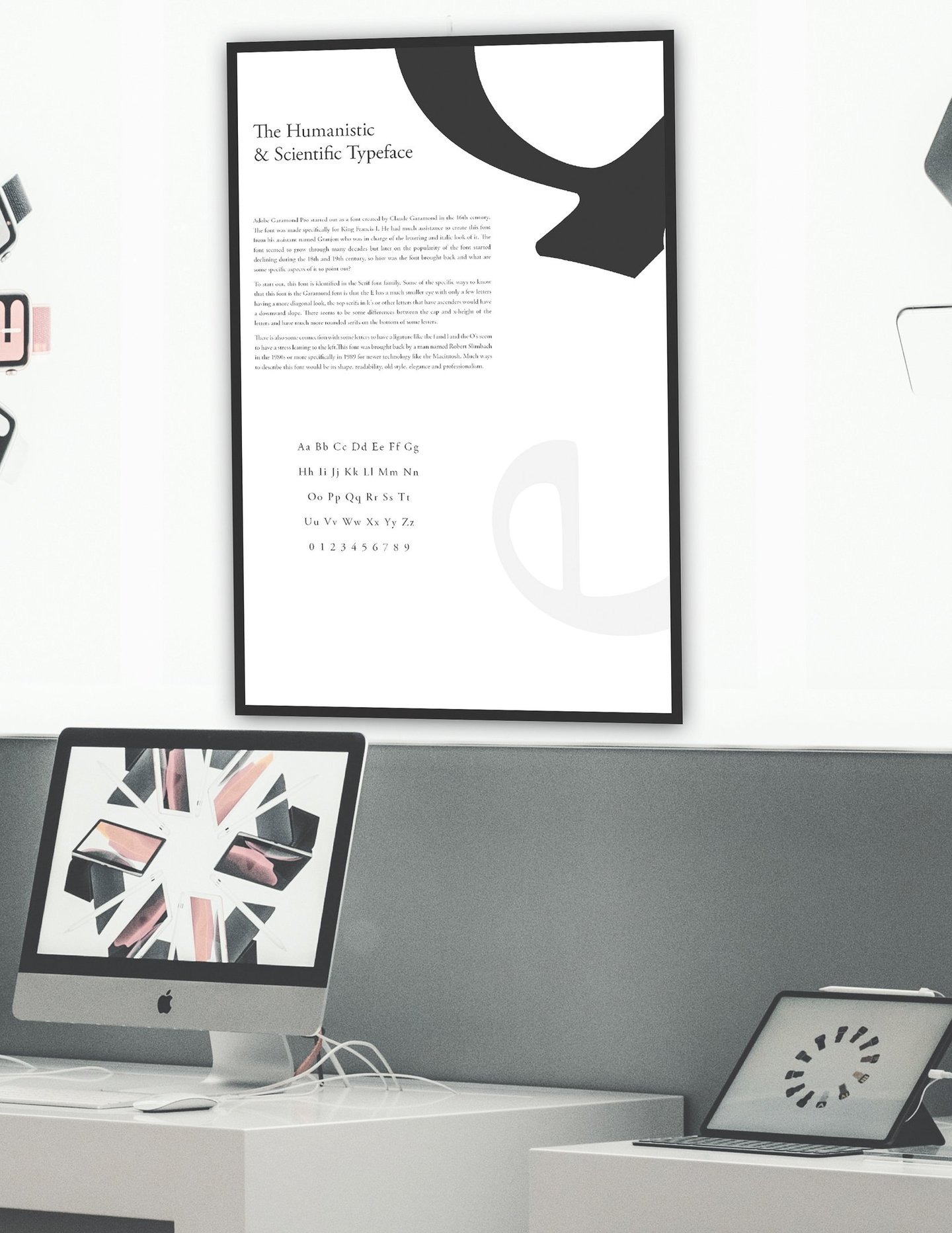
ABOUT THE PROJECT
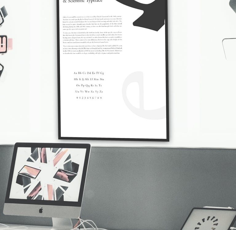
The Adobe Garamond Pro poster was designed to both showcase a concise study of the typeface and function as a decorative piece suitable for a home or office setting. The layout emphasizes clear visual hierarchy and generous spacing, allowing viewers ample breathing room to engage with the content while highlighting detailed close-ups of the font’s defining characteristics.
Key features—such as the eye of the lowercase “e” and the curved descender of the uppercase “H”—are prominently displayed to illustrate what distinguishes Adobe Garamond Pro from other typefaces.